For me, the new-ish label (and 2008 CFDA/Vogue Fashion Fund runners-up) Vena Cava is a line made for a hands-on graphic designer; the kind who still use trace paper to design logos, and who have a stash of colored contact paper from the old days when Saul Bass was making all of those Hitchcock posters we still love. Not in the sense that their pieces are particularly graphic, or bold, but in the sense that they are sort of DIY-looking (no, I don't like the term DIY either, but it fits). The slightly de-saturated color palette, and hand-drawn patterns speak to a person who appreciates color and form.
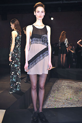
This go around the girls of Vena Cava seemed to take a different, (again) more refined route, pumping out 21 looks that not only lacked cohesiveness, but also lacked that fun handmade feel. I won't knock the presentation completely - it was successful for reasons outside of my expectations; it was more grown up, darker, and a new direction for the girls, but perhaps a transition that wasn't quite felt out. Come fall, when shopping Barney's, I'll be happy to mentally edit out most of these looks to scout out the few signature Vena Cava-ish pieces from this collection.


No comments:
Post a Comment